Dear Moderator

Heya!

This is my AS Media blog which features my progression throughout the year, including:
-First college magazine
-Research and planning
-Final music magazine
-Evaluation

My evaluation starts from the 9th of March, and my research and planning from September 2011. My completed music magazine is right after this post, so feel free to scroll on.

I hope you enjoy my posts!

Many Thanks

Philippa.

Saturday 24 March 2012

Evaluation - Question 7 - Looking back at your preliminary task, what do you feel you have learnt in the progression from it to the full product?


 FRONT COVER
The change between my college magazine and my music one, is very distinctive.  As you can probably tell, I've used a wider range of technology on Photoshop to make my music mag' look more professional. On the college magazine, I've just kept a plain background and left a load of white space - covering it up with a spray painted splash tool.  The title 'Kicks' overlaps one of the splashes, making it look pretty stupid.  I didn't know at the time, how to use the layers style on Photoshop, but as I've progressed onto my main music magazine, I've used it appropriately, and the model manages to overlap LEET well.  Also, the photograph on my college magazine is badly cropped, where parts of the actual clothing are left out or cut off, making the outline disorientated.  I've managed  to crop out the image perfectly on my music magazine - the outline isn't disorientated and I also chose to give it an outline glow, after learning a bit of the Photoshop options.  The whole layout of my college magazine looks shabby, and very amateurish.  None of  the subtitles are in a layout way, and they're just plotted everywhere.  On LEET, I decided that I'd have a more compex layout, and that's how I developed the 'T' into a content-store. Also the colours aren't really attracting on Teenage Kicks, due to the amount of white left.  I didn't make the image bright enough aswell, so the model looks washed out like it would without an SLR.  My use of imagery and word of text is definitely better on LEET, as it's more emphasized.


 I've developed my magazine greatly between LEET and Teenage Kicks.  The pictures on my college magazine are shabby, and don't look professional, or suite the type of magazine that I was doing.  As mentioned before on my front cover, they look amateurish. The photographs on my music contents page, look like they'd probably feature in a well known magazine.  I've learned that to pull off a good magazine, you need to have photos that are going to attract readers, and not make people put the magazine back.  I've achieved this though, through using SLR cameras.  The entire layout of the LEET contents looks more complex.  I've used a wide range of different shapes, giving it a different look with the whole 'white background subtitles' contrasting against the white T - whereas, on my college magazine, there's no layout at all.  It's just a white background with a plain title, that I clearly haven't developed or given thought about. There's not enough content on there to inform a reader, and probably wouldn't even be put in a magazine.  I've used a wider range of texts as well on LEET, due to the fact that I need to inform readers if they're paying for a  high classed magazine.  Giving a 'band index' and a sidebar of contents makes the magazine looked more developed on a whole. Teenage Kicks basically has nothing on LEET.

Thursday 22 March 2012

Monday 19 March 2012

Evaluation - Question 2

How does your media product represent similar and particular social groups?
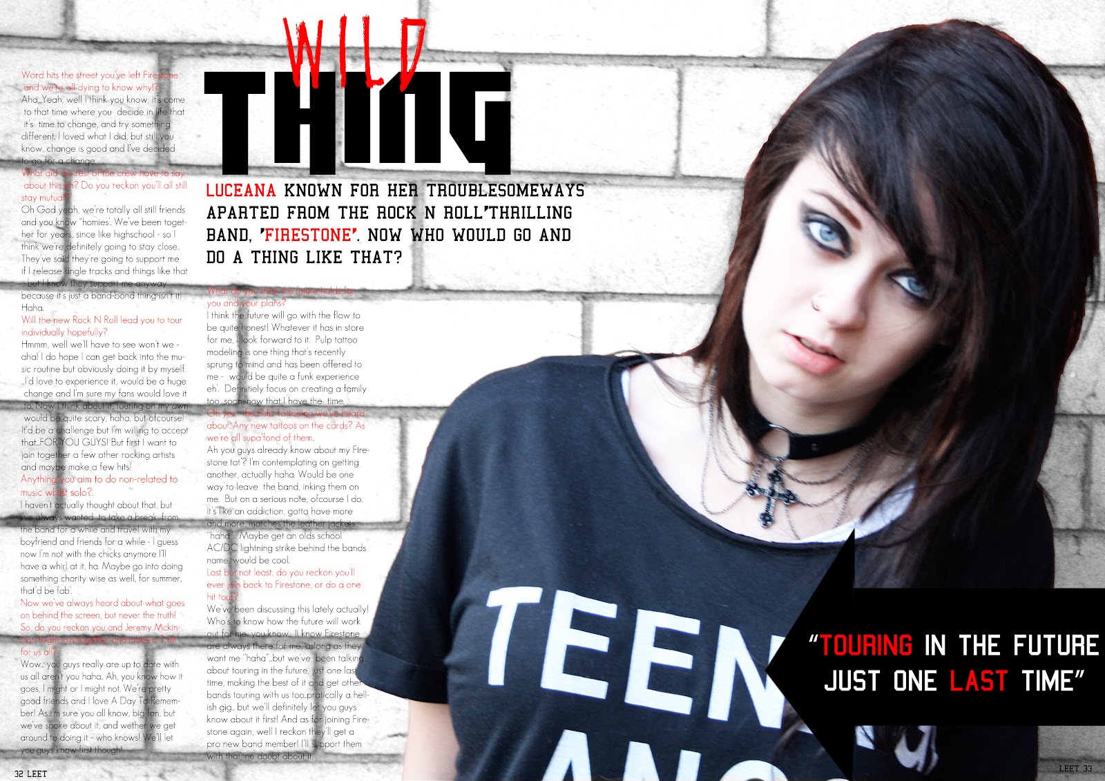
The Taylor Momsen image is taken from  an actual Kerrang magazine, double page spread which is what my photo I've taken, is also used for.  I found this image to begin with, and based my photo on it, as I though the posture and the style suited the genre what I wanted to achieve.
One of the main similarities would be the shot type.  I decided it would look good to do a medium close-up, with spacious image to the left or to the right. It captures the outfit of the model, and also the facial expression, which gives off attitude.  I decided  to also make the photo a single one, with just one person in, like the Kerrang solo artist one.
The whole posture and angle of the photo is  taken similarly too, but on different sides (flipped vertically etc).  Both models heads are tilted to the left or the right, with a wide open 'gasp' type of expression - which is another similarity, with them staring into  the camera. 
Costume wise, I liked the look of  the collar necklace on Taylor, as it enhanced that area & made the face stand out more, which is what I wanted to achieve.  I also liked the whole  eye make-up.  It matches the whole Kerrang style.  I would of probably still chosen to go with this style, if doing a different photo but it matches the genre I like, best.
There's hardly and differences between these two photos.  One of them would be the main costume, as my model has a top with white, distinct writing on, whereas the Kerrang model one has just a plain leather jacket, which matches the genre more.  
Another difference would be, the back ground of the photo.  My model was intentionally meant to be cropped out of the background, but the difficulties of doing so meant I couldn't, and her black hair wouldn't match the  background like it does in the Kerrang one.
Lastly, the slightest thing different between these photos would be the hand that isn't used on my model.  It gives more attitude, towards Taylor, but I didn't think to do this on the model at the time.

Evaluation - Question 1 - Double Page Spread

Used
I've used the text of the main title, mainly because when I opened this magazine myself, it stood out and the wording was quite catchy, with the whole 'wild'.  It's something that attracts the readers I'm looking to appeal, but instead I changed 'child' to 'thing' - kind of matching the song, that's famously known - as people will probably recognise that song, just making them think a bit more (even though the genre isn't similar, but it's still worldwidely known).
The layout of the actual questioning, I've used aswell.  The photo takes up practically one page, whilst the questioning and answering is on the other page.  It captures the readers, and draws them in - the colour scheme working well with it too.
Develop
The models clothing is kind of similar to my model.  Dark make-up and dress sense, aswell as the gothic choker that gives off the rock genre. The pose giving off the 'What?' attitude to, although Taylor's is kind of different - which is how I've developed it, as I've gone for a more moody attitude that suites the story.
Another thing I've developed is little subtitle on Kerrangs magazine.  On mine, I've changed it to an arrow, and a quotation that comes from the right hand side.  I've decided to do this, so the whole 'arrow' theme is continued throughout the magazine, like on the front and content page.
Challenged
The only thing I've partly challenged on these two pages, is part of the main photograph.  I decided to invert the background and the model, and change the brick walling to a embolded greyscale, unlike Taylors background that's just plain black.  I wasn't aiming for the entire gothic chick look on this page, as I wanted it to be a punk/grunge kind of one, even with a female model, so to change it I decided to do this.

Evaluation - Question 1 - Contents Page


Used
I  decided to take the band index and use it in my magazine.  It gives quite a different, unique feature compared to other magazines, that may make it better, or appeal more to the readers. However, the layout of it, I changed, so that it fitted the layout of my own magazine and made space for the 'T' on the headline.
The second thing I used was the idea of layout with the contents. I've used similar headings, as yes probably other magazines will have similar, but it fits the style to mine.  Also changing the background colours of the main headers and the mini-contents underneath it - that include the page numbers - differentiates their difference for the reader.  Pretty much chose to do this because it looks funky, instead of leaving it entirely large or something.
Developed
I've copied, pretty much the layout of the magazine, with the images being in the middle. It looks good as it draws the attention to the photo's, and they're not all scattered about - like say on some magazines, for instance, a Kerrang contents page sometimes has loads scattered about. The way I've developed it, is by just dividing the photo and having borders around it but with different captions undearneath that explain both of which is happening.
Challenged
I've used a photograph in the bottom left hand corner of my photo, overlapping the contents.  It's quite different, as I haven't come across it through magazines.  For me, I just put it there  because it added more features to the contents page, and the way the background of it, underlapped the 'T', gives it a distinct look.
I also added a mini photograph of the magazines front cover on the contents page - makes the magazine look proffessional and the 'NEW' next to it, that differs from the others 'band index' headline, suits it quite well.  It informs readers, whilst still looking unique.

Friday 9 March 2012

Evaluation - Question 1 - Front Cover

Used

The red bar down the side of  the page, with content in, is something I could class as developed.  It matched  to have the red bar made from having the 'T' dragged down, and also  gave me somewhere to put the main subtitles of the magazine, making the mag' unique. I chose to do this and for it to feature on my magazine as it gave a different look compared to all the others, and this style was only used once on a Kerrang magazine, so it's not exactly common.
The next thing I used was the overhead image, overlapping the title. It's used on the majority of magazines, but I've used it due to the model being the main idol on the magazine, so they should be the most important - hence why they're stood out by overlapping the title.

Developed
At the top of the magazine, Kerrang used a photo slide featuring on their front cover, whereas I chose to do a font version. I chose to do this because I prefered to keep it simple rather than over crowd it with pictures, as the T on 'Leet' makes the magazine bright and too many pictures would be overwhelming.  The fonts also give me the chance to make them colour co-ordinated which makes the magazine look better overall.
The content on the red bar on the kerrang magazine is similar to the content on mine. I've put the subtitles in a bold colour and font and then undearneath given a brief description of what's featured.  he reason why it's developed is because I haven't used pictures, as for the same reason as the top of  the magazine.  I chose to use this feature on my front cover, as it'd look good using up the T space, giving it a unique look, as well as matching the whole colour co-ordination.
I kind of developed the picture on the red bar, but only because it's the second larger image out of the whole magazine and the positioning of it.  It's practically like the second main title, or main feature on the front cover hence why it's larger.  The difference is, mine isn't a band or something like that, it's a competition and is rather different. 

Challenge
The main subtitle under  the image is something I've made completely different.  Kerrang's is just normal text featured, whereas I've choice  to give it a different style to make it unique - also it's a quote, and not entirely just a capturing slogan/subtitle for the picture or even just the band name.  The whole thing being emboldened makes the image look more important, aswell as the story - Not forgetting that it makes the magazine look more proffessional and unique compared to all the others.